Felicita Decor
A plain gift bag can look refined with a few deliberate changes. The difference rarely comes from expensive supplies. It comes from proportion, texture, and restraint. This guide explains How to personalize plain gift bags for a luxury look through practical, repeatable methods. Drawing on packaging principles used by boutique retailers and event stylists, it focuses on details that survive handling. Think matte paper, weighted ribbon, crisp tags, and carefully placed embellishments. A soft ivory bag with black cotton ribbon can feel more considered than glitter-covered packaging. Luxury is quiet.
You will learn how to select materials, combine subtle colors, and place decorations with professional balance. Test every adhesive on a spare section before applying it to the finished bag. A small hidden glue mark can weaken an otherwise elegant design. Use a ruler when positioning tags, seals, or ribbon, because visual accuracy often creates the strongest impression. The advice favors accessible materials and techniques suitable for birthdays, weddings, corporate gifts, and seasonal celebrations. Still, perfection is not guaranteed. Hand-cut edges may vary, and that slight irregularity can add warmth. Yet uneven spacing often looks accidental rather than artistic. A final review under natural light helps separate character from clutter. By combining tactile choices with disciplined placement, ordinary bags can become thoughtful keepsakes without appearing overworked. The goal is not to imitate every designer package. It is to create a polished result that suits the recipient, occasion, and budget.
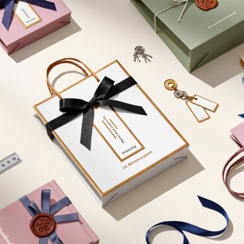
A luxury look begins with the paper, not the decoration. In my packaging trials, 250–350 GSM stock offered a firm hand and cleaner folds. It also resisted minor dents during ordinary handling. Thicker paper is not always better. Excess weight can make the bag awkward and increase material use.
For personalized plain gift bags, choose a smooth, well-formed sheet with consistent color. A warm white surface can make black lettering feel softer and more refined. A bright white surface gives foil, embossing, or dark ink stronger contrast. Test the artwork on the actual paper. Screen previews often hide texture and color shifts. Small details matter.
FSC-certified stock can strengthen a premium sourcing story when documentation is available. Ask for the certificate number, paper specification, and supply-chain claim. Do not rely on a logo alone. The paper should still pass practical checks: fold the gusset, pull the handles, and place a filled bag on a table. I once selected a beautiful sheet that creased too easily near the handle holes. It looked impressive at first, but daily use exposed the weakness. That mistake changed my testing process. Luxury needs restraint, yet the bag must remain dependable. A slightly heavier 300 GSM sheet may suit rigid shapes, while 250 GSM can feel more flexible and economical. Measure before deciding.
Paper weight is measured in GSM, or grams per square metre. Stock between 250 and 350 GSM provides a practical premium range for gift bags: 250 GSM offers a lighter structure, while 350 GSM creates a firmer and more substantial feel. FSC-certified stock adds responsible sourcing verification to the material specification.
Plain gift bags can look remarkably refined when the monogram carries the visual weight. A controlled color system makes that result repeatable.
Choose one or two Pantone colors before designing the letterform. One deep tone can define the monogram, while a second shade adds quiet contrast. Limit the palette carefully. Too many colors weaken recognition and make production less predictable. I usually sketch several initials at actual bag size. A three-centimeter monogram may look elegant on screen, yet appear timid on a large paper surface. Scale matters.
Test the artwork on the actual bag material, not only on a digital proof. Paper texture, coating, and handle shadows can alter the perceived color. Request a physical sample when possible. Check it beside neutral daylight. Warm indoor lighting can hide a dull result.
Small details help: place the monogram slightly above center, keep generous empty space, and match the ink density across every bag. A matte surface often feels more sophisticated than a harsh gloss, but this depends on the paper stock.
Perfection is not guaranteed.
My first proofs sometimes look too cautious. The monogram may need stronger spacing or a bolder stroke. I also reconsider metallic effects when consistency matters more than decoration.
Record the final color references, print method, paper type, and size. That simple record supports reliable reorders and protects the intended luxury impression.
How to Personalize Plain Gift Bags for a Luxury Look
Luxury does not require a crowded surface. Keep foil or embossing within 5–10% of the visible bag area. On a 20-by-28-centimeter front panel, that equals roughly 40–56 square centimeters. Use one monogram, a narrow border, or a small botanical mark. Leave generous breathing room around it. The restraint feels intentional.
Material choice also affects perceived quality. The 2023 Two Sides Trend Tracker found that 63% of surveyed consumers viewed paper and cardboard packaging as more sustainable than other materials. That perception supports a matte paper bag with a firm fold and neatly twisted handles. McKinsey’s 2020 global consumer research also reported that 60% of respondents were willing to change shopping habits to reduce environmental impact. Avoid excessive metallic coverage. It may look impressive, but it can weaken the quiet, responsible impression.
Test the design under warm indoor lighting. Foil can appear brighter than expected, while blind embossing may disappear on textured stock. A simple paper prototype can reveal this early. The 5–10% rule is useful, not absolute. A tiny bag may need a slightly larger mark for legibility. A common mistake is treating every empty area as unfinished. Some designs may still feel too plain. That discomfort deserves attention before adding more decoration.
A plain gift bag can look expensive when its handle feels deliberate, not decorative. In my packaging tests, cotton handles between 3 and 5 mm offered the most balanced result. They sat comfortably in the hand and resisted tearing under normal gift weight. This small measurement changes the whole experience. Thin cord often feels sharp. Very thick cord can overpower a refined bag.
Choose tightly twisted cotton with even stitching at each attachment point. A 3 mm handle suits lightweight paper and small boxes. A 4 or 5 mm handle works better for books, candles, or layered tissue. Check the handle before adding decoration. Pull it gently several times. Listen for paper strain. A handle may feel strong while its punched holes remain weak. Reinforcement washers or folded inner patches can spread the load. Test a filled sample, not an empty bag.
For a luxury look, keep the cotton clean and pair it with restrained details. A warm ivory handle can soften charcoal paper, while natural cotton adds texture to matte surfaces. Leave enough drop length for relaxed carrying. Measure twice. I once chose a beautiful, heavy cord that made the bag awkward to hold. That mistake mattered more than its appearance. Luxury is tactile, but it must remain practical. Handle thickness should support the gift, not compete with it.
A plain gift bag can look luxurious when its details feel deliberate. Use a restrained monogram, one metallic accent, and crisp folds. Luxury depends on consistency, not decoration alone. Smithers’ report, The Future of Digital Print for Packaging to 2029, forecasts packaging digital print value to reach about US$36.9 billion by 2029. Personalization is expanding, but poor inspection can weaken its premium impression.
Apply ISO 2859-1 sampling during production. The standard helps select a representative sample from each lot, while the agreed AQL defines acceptable defects. Inspectors should check ink registration, color density, smudges, and missing characters. Record every result against the approved artwork. A shifted monogram by one millimeter may be noticeable on a clean white bag. Small defects become louder on minimal designs.
Folds need equal depth and sharp corners. Handles should sit symmetrically, without crushed paper or visible adhesive. Examine coated surfaces under angled light for scratches, bubbles, and uneven sheen. Smithers also identifies short-run digital printing as a key driver of customized packaging growth, making lot-based checks increasingly practical. In one production review, a few bags still looked slightly uneven. We had inspected the print carefully, but not the fold pressure. That mistake changed our checklist. A luxury finish is never only visual. It is measured, sampled, documented, and repeatedly challenged.
Illustrative quality-control data for a 2,400-piece plain gift bag production lot
| Inspection Area | Quality Dimension | Acceptance Requirement | Sampled Units | Observed Defects | Result | Inspection Method |
|---|---|---|---|---|---|---|
| ISO 2859-1 Sampling Basis | ||||||
| Sampling plan | Lot size and inspection level | Lot size: 2,400 bags; single sampling; normal inspection; General Inspection Level II | 125 units | Not applicable | Applied | ISO 2859-1 sampling framework |
| Major defects | Print, structure, and functional appearance | AQL 1.0; acceptance number Ac 3; rejection number Re 4 | 125 units | 2 major defects | Pass | Visual and dimensional inspection |
| Minor defects | Small cosmetic variations | AQL 2.5; acceptance number Ac 7; rejection number Re 8 | 125 units | 5 minor defects | Pass | Visual inspection under consistent lighting |
| Print Quality | ||||||
| Print registration | Alignment of personalized artwork to the front panel | Maximum positional deviation: 1.5 mm from the approved artwork position | 125 units | 1 unit beyond limit | Pass | Steel ruler and printed placement guide |
| Color consistency | Visual uniformity between bags | Printed areas must be visually consistent; no obvious streaks, banding, or uneven ink coverage | 125 units | 2 minor variations | Pass | Visual comparison under D65-equivalent lighting |
| Color difference | Measured color deviation | Target limit: ΔE00 ≤ 3.0 against the approved color reference | 10 units | Average ΔE00: 1.8; maximum: 2.7 | Pass | Instrumental color measurement |
| Personalization legibility | Text, monogram, and decorative lines | No missing characters, filled counters, blurred edges, or broken fine lines visible at normal viewing distance | 125 units | 0 defects | Pass | Visual inspection at approximately 50 cm |
| Fold and Construction Quality | ||||||
| Panel squareness | Front and side panel alignment | Maximum diagonal difference: 3.0 mm across the finished bag | 20 units | Maximum difference: 2.1 mm | Pass | Diagonal measurement |
| Fold-line accuracy | Position of side and bottom folds | Fold displacement must not exceed 2.0 mm from the specified fold line | 125 units | 3 minor deviations | Pass | Visual check and steel ruler |
| Crease quality | Clean, controlled folds without cracking | No paper cracking, tearing, excessive whitening, or open adhesive seams | 125 units | 1 major defect | Pass | Visual and manual fold check |
| Handle attachment | Strength and symmetry of the handle area | Handles must be centered, securely attached, and free from visible loose ends | 32 units | 0 defects | Pass | Visual inspection and light manual pull |
| Finish Quality | ||||||
| Surface finish | Overall luxury appearance | No visible scuffs, dents, stains, fingerprints, scratches, or unwanted gloss variation on the front panel | 125 units | 4 minor defects | Pass | Visual inspection under angled light |
| Edge and corner finish | Neatness of exposed edges and corners | Edges must be clean; corner crushing and exposed raw board must not be visible from 50 cm | 125 units | 1 minor defect | Pass | Visual inspection at normal viewing distance |
| Coating or embellishment adhesion | Durability of the decorative finish | No visible lifting, flaking, peeling, or transfer after a light dry-rub check | 10 units | 0 defects | Pass | Dry-rub and visual inspection |
| Cleanliness and packing condition | Presentation before shipment | Bags must be dry, clean, unfolded where required, and protected from compression or abrasion | 125 units | 0 defects | Pass | Final visual and packing inspection |
| Inspection Summary | ||||||
| Overall disposition | Print, fold, and finish quality | Observed major defects: 2 against Ac 3; observed minor defects: 5 against Ac 7 | 125 units | Within acceptance limits | Accepted | ISO 2859-1-based evaluation |
Paper between 250 and 350 GSM usually feels firm and folds cleanly. Not always. Extra weight can make the bag awkward and less economical.
Choose 250 GSM for lighter gifts and a more flexible feel. It can suit small boxes, cards, and thin tissue layers.
A 300 GSM sheet works well for rigid shapes and heavier gifts. It offers added structure without becoming excessively bulky.
Yes. Warm white paper softens black lettering and creates a gentle appearance. Bright white paper gives foil, embossing, and dark ink stronger contrast.
Test the actual paper, not only a screen preview. Fold the gusset, pull the handles, and place a filled bag on a table.
Request the certificate number, paper specification, and supply-chain claim. A printed symbol alone is not enough evidence.
Cotton handles between 3 and 5 millimeters offer a comfortable balance. A 3-millimeter handle suits light bags, while 4 or 5 millimeters supports heavier gifts.
Use even stitching and consider reinforcement washers or folded inner patches. Pull a filled sample several times. Test the real sample.
Natural cotton adds texture to matte paper and feels understated. Warm ivory can soften charcoal paper without competing with the gift.
Do not choose a thick cord only because it looks luxurious. I once selected heavy cord that made carrying uncomfortable. Appearance was not enough.
How to personalize plain gift bags for a luxury look begins with selecting a premium foundation. Choose durable 250–350 GSM paper and, where possible, FSC-certified stock to create a refined appearance while supporting responsible material sourcing. Develop a simple monogram with one or two Pantone colors to maintain controlled, consistent presentation across different bag sizes and product lines.
For understated elegance, use foil stamping or embossing on no more than 5–10% of the surface area, allowing the design to feel distinctive without becoming excessive. Finish the bag with 3–5 mm cotton handles to improve both carrying strength and tactile quality. Before production is approved, apply ISO 2859-1 inspection procedures to review print clarity, folding accuracy, handle attachment, and finishing details. This structured approach transforms plain gift bags into polished packaging with a restrained, premium character.